MegaMan Matrix

Welcome, Guest. Please Log In or Register. Did you miss your activation email?
26 April 2024, 01:13:13
RadioGallery (OFFLINE)MBoard + MChatRegisterLog In
The MBoard  |  MegaMan Matrix  |  The Creation Station  |  : MoX's Art Thread
Pages: 1 2 » Print
Author Topic: MoX's Art Thread  (Read 40627 times)
MOX
Robot Master
****
Posts: 594


« on: 4 December 2007, 02:05:09 »

These are all stuff I did while MMM was down, these are pretty old. Lately though I think I got worse at drawing because I kept thinking about my future (boring I know >_>) and that my stuff looked like I was just copying from anime or something, so I really wanted to do something more realistic like but it ended up making my style look a lot worse, I think this is my fault for drawing nothing but robots and megaman stuff these years, I thought I could eventualy learn how to do more realistic stuff on my own but it's frusterating really so I'll have to look for drawing classes, I think hopefuly it'll make me better. ok i'm done LOL

These are from oldest to newestest.


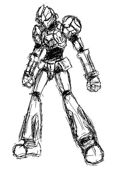
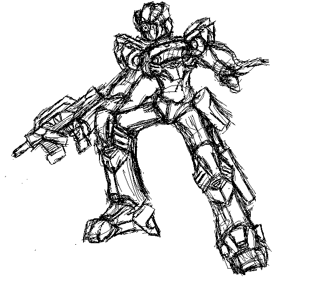
'rest I'll just post links since too many images will lag the page, still in order from oldest to newest from the past images.

http://img.photobucket.com/albums/v313/robertlieu/geometrysketch.jpg

http://img205.imageshack.us/img205/8677/strikegrapplerdj6.jpg
first practice since middle school on drawing something without mech armor LOL

http://img.photobucket.com/albums/v313/robertlieu/Thiefsketch.jpg
Thief class from RO

http://img.photobucket.com/albums/v313/robertlieu/oldknightmvpconcept.jpg
concept sketch I did before that boss like sprite I posted in the sprite thread.

After all of this it just went downhill. LOL Hopefully I can draw something I like that looks good as my last stuff in the future.

Logged
Chron
Super Robot
*****
Posts: 2790


« Reply #1 on: 4 December 2007, 02:07:33 »

These look pretty good. I do like the sketchy-yet-defined style you have going on (looks cool in the MSPaint as well).

I now see more of what you mean by needing a class on drawing humans. Proportions are a bit off. If you can find a cheap book (or one in a library) about that stuff, just reading it should help you out.

Also helps to draw from life a bit.
Logged
Johncarllos
Super Robot
*****
Posts: 6806


« Reply #2 on: 4 December 2007, 03:23:23 »

I like #3.
Logged

I can skin anything smaller than a bobcat in 30 seconds.
ASR
Super Robot
*****
Posts: 10911


« Reply #3 on: 4 December 2007, 03:27:45 »

I'm in love with that old knight drawing.
Logged

MOX
Robot Master
****
Posts: 594


« Reply #4 on: 4 December 2007, 07:10:02 »

Thanks for the comments. I've tried some books though I think I'll probably have to take a class for someone to explain the stuff to me up person. I'll try some more books before that though.

http://five.x10hosting.com

This is a web page I made in my Web Design class, just wanted to show a layout that I designed.
Logged
Chron
Super Robot
*****
Posts: 2790


« Reply #5 on: 4 December 2007, 14:52:51 »

Good with no frames. Looks spiffy, at that.

Only thing I see as a problem is that you don't have a doctype reference for a W3C standard, but that is sort of optional.
Just keeps it standardized.
Logged
DJz3ro
Noob
*
Posts: 37


« Reply #6 on: 14 December 2007, 01:32:10 »

Nice drawings, I especially like the third one.  8)
Logged


I am an MLG Pro
MOX
Robot Master
****
Posts: 594


« Reply #7 on: 6 January 2008, 02:07:14 »

RO Forum signature someone asked me to make. Like Chron I wanted to test some blurred stuff on PNGs too.

Logged
preventerWIND
Super Robot
*****
Posts: 6423


« Reply #8 on: 6 January 2008, 15:55:30 »

Looks mighty fresh Moxy.
Logged

LOL BANDWAGON
Johncarllos
Super Robot
*****
Posts: 6806


« Reply #9 on: 7 January 2008, 00:22:31 »

Very good!
I'm impressed.
Logged

I can skin anything smaller than a bobcat in 30 seconds.
Mikero
Super Robot
*****
Posts: 11982


« Reply #10 on: 8 January 2008, 02:15:29 »

R2 you're alive, and... shiny!

I like it. Shiny.
Logged

MOX
Robot Master
****
Posts: 594


« Reply #11 on: 8 January 2008, 16:39:41 »

Thanks for the comments guys.


I had 10 minutes left in my graphics class, we were supposed to do an animated gif so here's a tennis ball getting hit.
Logged
ASR
Super Robot
*****
Posts: 10911


« Reply #12 on: 8 January 2008, 21:21:23 »

It takes it a lot less time to get back UP to the racket than it does for it to fall after being thwacked by it. Odd.

Seriously, though, cool.
Logged

Mikero
Super Robot
*****
Posts: 11982


« Reply #13 on: 9 January 2008, 00:18:51 »

I realize you did it quick but just for the record;

-It needs to stretch vertically in the air.
-Nice squash on the bounce, but too much when it's hit.
-A normal ball, like a tennis ball, only bounces about half of it's height. I realize it's being hit and not falling so it going back up is OK but don't reuse the same frames as it falling and it just holds in the air, so the animation isn't actually a cycle. Also it bounces really fast.

I'm being an animation nerd now, but this is just the kind of stuff I automatically recognize now. Principles of animation and all that.
Logged

ASR
Super Robot
*****
Posts: 10911


« Reply #14 on: 9 January 2008, 03:20:17 »

It means you're learning! It means you're learning! How magical!
Logged

Mikero
Super Robot
*****
Posts: 11982


« Reply #15 on: 9 January 2008, 12:48:14 »

I learned that in like September 2006...
Logged

MOX
Robot Master
****
Posts: 594


« Reply #16 on: 25 January 2008, 02:35:51 »

We were supposed to create a magazine cover for my Graphics' class final. Mine's not finished but all there's left is the background which is going to be pretty simple, so I'll just show the part I worked on the most. There's supposed to be a after image of the text on the cover, but my old comp's monitor is pretty dim so I can't see it, or maybe my school monitors are just really bright.
Logged
Mikero
Super Robot
*****
Posts: 11982


« Reply #17 on: 25 January 2008, 02:51:43 »

I can see it. We've always known your monitor is dark though dude! Looks cool.
Logged

Johncarllos
Super Robot
*****
Posts: 6806


« Reply #18 on: 25 January 2008, 03:28:27 »

I can see it as well.
This looks sick!

Though, I wouldn't buy the magazine...
Unless it's all about videogame music, which I'm guessing it's a music magazine.
Logged

I can skin anything smaller than a bobcat in 30 seconds.
MOX
Robot Master
****
Posts: 594


« Reply #19 on: 24 February 2008, 23:51:36 »

http://img151.imageshack.us/img151/6741/22408reploiddesignzx4.jpg

First MM-related drawing of 2008. I don't care much about the color scheme but I personaly kinda like the feet design. I dont like how his left leg turned out but that's the best I could do with foreshortening.
Logged
Mikero
Super Robot
*****
Posts: 11982


« Reply #20 on: 24 February 2008, 23:53:56 »

Reploids are never that complicated, but it's pretty cool.
Logged

preventerWIND
Super Robot
*****
Posts: 6423


« Reply #21 on: 25 February 2008, 00:03:39 »

Looks great, but the neck looks like it's too far from the right shoulder.
Logged

LOL BANDWAGON
MOX
Robot Master
****
Posts: 594


« Reply #22 on: 6 March 2008, 01:49:46 »

Mikero: True, I like to just slap on random details but all I can usually draw for that is reploid-esque stuff.

Wind: I can move the head a bit and see how it works out.


Sketch I was working on, the legs took me 2 days because It stressed me out a lot. I wanted to try a dynamic pose for a change, so I tried to do some fore shortening on the legs. I was way over my head obviously when I put all those details on his right leg and expected to draw it at a different angle for the left. His left leg took a lot of trial and error, I'm still not happy with it (especially the foot) but I'm atleast satisfied that it matches his other leg a bit. Though, atleast if I stop drawing the same standing poses all the time and try different things it'll help me progress faster.

I didnt want to come up with a color scheme so did some scratchy grayscale shading on it. I tried to keep the lines a bit cleaner this time by erasing a lot. Design's vaguely military based so that answers the question "wtf y do reploids need ammo".
Logged
Johncarllos
Super Robot
*****
Posts: 6806


« Reply #23 on: 6 March 2008, 02:58:17 »

Nice, but it gets really jumbled in the middle, I'd suggest wither more value contrast. Adding color might do the trick though.
For what it was, and how long you spent, it appears successful.
Logged

I can skin anything smaller than a bobcat in 30 seconds.
MOX
Robot Master
****
Posts: 594


« Reply #24 on: 6 March 2008, 03:16:29 »

Thanks, I'll try to get the lines cleaner and add some color next time.
Logged
Johncarllos
Super Robot
*****
Posts: 6806


« Reply #25 on: 6 March 2008, 21:27:08 »

Not even the lines so much, it's just that without any really dark spots on it, I can't tell if something is part of the chest or a blade off the elbow, slap a shadow underneath the bottom of the arm and across parts that should be darker and it will be a simple way to make it  much more successful.

I like the lines the way they are, it's a dramatic style that gives any pose action.
Logged

I can skin anything smaller than a bobcat in 30 seconds.
The Otaku
Robot Master
****
Posts: 523


« Reply #26 on: 8 March 2008, 10:34:17 »

Nice stuff. I like the first three. The sketchiness makes them look cool.
Logged

MOX
Robot Master
****
Posts: 594


« Reply #27 on: 16 April 2008, 16:21:52 »

I actually did this last year in my web design class, I found it recently and thought it looked neat so decided to show it here.
Logged
Vinchenz Rock
Super Robot
*****
Posts: 3642


« Reply #28 on: 16 April 2008, 16:24:12 »

That looks like a neat background to put on my PSP...

CAN I DO SO!?
Logged

MOX
Robot Master
****
Posts: 594


« Reply #29 on: 17 April 2008, 02:50:36 »

Sure, though you'd probably want to remove the text.
Logged
Mikero
Super Robot
*****
Posts: 11982


« Reply #30 on: 17 April 2008, 03:01:22 »

I dig it. Has a sort of 70's vibe with the colours and shape style too.
Logged

MOX
Robot Master
****
Posts: 594


« Reply #31 on: 18 September 2008, 01:16:37 »

Thanks!


I did this last week, I was supposed to create a brochure of the world during the 1920s for my english class.

I stole the color scheme from the last design I showed because I could'nt think of anything at the time, though I'm showing it since I thought the design looked ok.

This was resized by about 90% so the quality isn't the greatest.

Posted on:  1 May 2008, 06:56:37

Haven't done any creative work over this summer, I think too many distractions kinda killed by creativity haha.

We were supposed to make a cover for our graphics class so here's mine.

http://img209.imageshack.us/img209/816/graphicsclasssofarcovertd2.jpg
Logged
Johncarllos
Super Robot
*****
Posts: 6806


« Reply #32 on: 18 September 2008, 01:47:29 »

Nice job Robert!
Logged

I can skin anything smaller than a bobcat in 30 seconds.
ASR
Super Robot
*****
Posts: 10911


« Reply #33 on: 18 September 2008, 01:55:27 »

I actually rather like it.
Logged

Vinchenz Rock
Super Robot
*****
Posts: 3642


« Reply #34 on: 18 September 2008, 01:59:47 »

I thought it looked bad and Jagged.

Then my mouse hovered over it, and it increased its size (thanks to Text-To-Image).

Awesome work. b('.'d)
Logged

preventerWIND
Super Robot
*****
Posts: 6423


« Reply #35 on: 18 September 2008, 02:51:48 »

This is damn fresh, nice work Mox.
Logged

LOL BANDWAGON
Mikero
Super Robot
*****
Posts: 11982


« Reply #36 on: 18 September 2008, 04:22:13 »

I probably would've chosen colours that compliment each more (not really more, but more typically) but those actually look great.
Logged

MOX
Robot Master
****
Posts: 594


« Reply #37 on: 7 October 2008, 05:08:36 »

Thanks guys  :).

Here's a horrible drawing I did in like 15 minutes, I actually did it early in the year and the reason im showing it is because I need to rack up my post count I thought it'd be nice to show it.

IGNORE THE CUT OFF CAPE YOU SAW NOTHING GOVERNMENT CONSPIRACIES


o and repitition is a principle of design

Logged
Vinchenz Rock
Super Robot
*****
Posts: 3642


« Reply #38 on: 7 October 2008, 05:37:18 »

That looks pretty cooll.

So cool, I put two "Ls" in cool.
Logged

MOX
Robot Master
****
Posts: 594


« Reply #39 on: 28 November 2008, 06:51:37 »

Did this a few weeks ago, I had to create a booklet cover for our school's orchestra. I was originally stummped on an idea and just drew a square, and then built up on that. If I could fix it I'd add an extra string on it since it'd make more sense.
Logged
Johncarllos
Super Robot
*****
Posts: 6806


« Reply #40 on: 28 November 2008, 14:29:58 »

I like that.
Logged

I can skin anything smaller than a bobcat in 30 seconds.
Captain Sanoguchi
Super Robot
*****
Posts: 3211


« Reply #41 on: 29 November 2008, 05:19:16 »

There's an old myth.
They say every Black Friday MOX flies down and collects all the leftovers and leaves behind a pretty neat looking booklet cover for his school's orchestra.
Logged
MOX
Robot Master
****
Posts: 594


« Reply #42 on: 1 January 2009, 09:45:59 »

It doesn't look impressive but this was a composition practice I did, I was supposed to only use black and white colors, and circles, squares, and lines to describe Strength/Weakness, Happiness/Sadness, Stress/Lazy, and Natural/Artificial. For me it was fun to play around with and I'm really starting to appreciate graphic design more.
Logged
ChaosVortex
Super Robot
*****
Posts: 5638


« Reply #43 on: 14 January 2009, 17:19:06 »

I enjoyed that.
Logged

[ N ][ M ][ C ]
[ S ][ - ][ E ]
[ J ][ V ][ W ]

Mega Man and Yu-Gi-Oh! fanatic!
https://www.lulladin.weebly.com
Mikero
Super Robot
*****
Posts: 11982


« Reply #44 on: 15 January 2009, 03:22:31 »

Pretty cool.
Logged

MOX
Robot Master
****
Posts: 594


« Reply #45 on: 12 March 2009, 03:21:35 »

Last January as an assignment for my Graphics class I was supposed to create a logo for the Dinosaur Dash, which is a marathon jogging even thats been around for awhile in my area.

On Monday I had a pretty boring day, but at last period they announced that my logo won and gave me a $100 so that made me really happy. I don't care about the money as much as I do about the fact that the logo will be on a bunch of shirts and posters though. I like the work I've done on the logo despite the sloppy pen tool work.


I'LL POST SOME NON SCHOOL RELATED STUFF AT SOME POINT
Logged
preventerWIND
Super Robot
*****
Posts: 6423


« Reply #46 on: 12 March 2009, 03:38:58 »

A dinosaur with running shoes? I like. I like a lot.
Logged

LOL BANDWAGON
Mikero
Super Robot
*****
Posts: 11982


« Reply #47 on: 12 March 2009, 05:44:22 »

That dinosaur is doing the goose-step.
Logged

Chron
Super Robot
*****
Posts: 2790


« Reply #48 on: 12 March 2009, 12:40:04 »

His arms are too short of the salute though.

Always nice to see your art in different places.
Logged
MOX
Robot Master
****
Posts: 594


« Reply #49 on: 12 March 2009, 22:01:38 »

Thanks a lot guys.  :)

Also just wanted to note incase you guys didnt see but there's a hidden dinosaur head. Just noting since a lot of people weren't able to notice untill I told them.
Logged
Pages: 1 2 » Print 
The MBoard  |  MegaMan Matrix  |  The Creation Station  |  : MoX's Art Thread
Jump to:
Cannot access offset of type string on string
Powered by SMF 2.0.18 | SMF © 2006-2008, Simple Machines LLC
Go to top
Add MegaMan Matrix to your Favorites
Original content © 1999-2007, Abominator.
Trademarks are copyright their respective owners.